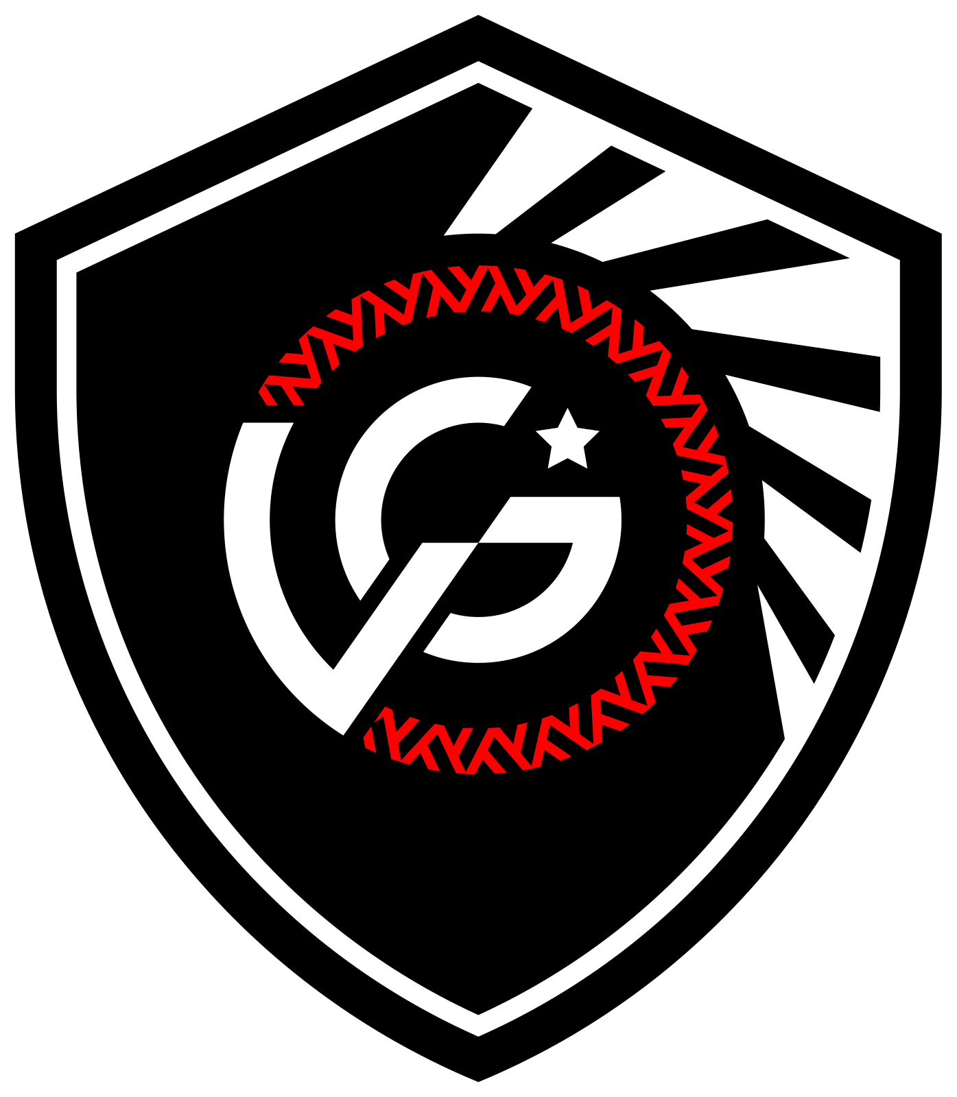
Primary crest
The primary mark for club identification, kits and official documents.
THE VÁRZEA GRANDE EC IDENTITY
The crests, colours and guidelines for representing VG consistently across every application.
EDITION 1.0 · OCTOBER 2026 · 16 PAGES
The primary mark for club identification, kits and official documents.
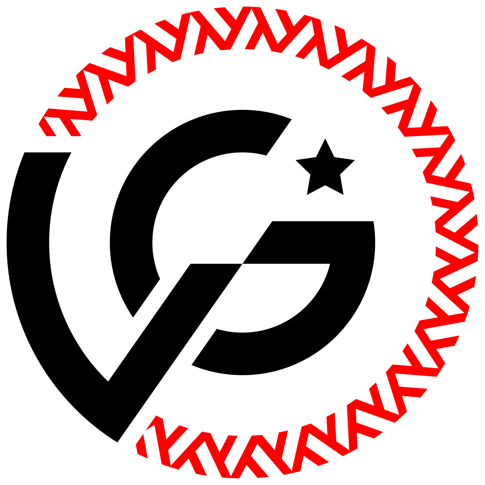
The circular mark for avatars, icons, compact spaces and supporting applications.
Preserve the design, proportions, colours and clear space. Start with the files provided on this page.
Positive for light backgrounds; negative for dark backgrounds. Red remains part of the design.




Single-colour alternatives for engraving, cut vinyl, stamps and processes with limited inks.
Black and red are the primary colours. Sand and burgundy support the identity; white provides contrast.
Primary colour. Crests, text and contrasting backgrounds.
Primary colour. Brand details and communication accents.
Supporting colour. Light backgrounds and clear space.
Supporting colour. Club backgrounds and website highlights.
Supporting colour. Open areas, contrast and negative versions.
Use HEX/RGB on screens and the Pantone reference or CMYK values appropriate to the printing process. Check the supplier's proof before production.
The source file lists RGB 150/50/51 and HEX #9B3233 for burgundy. This edition standardises digital use on the supplied HEX value, which equals RGB 155/50/51.
For sand, the CMYK 5/11/29/100 listed in the source file does not match the light swatch. Use Pantone 7506 C as the reference and convert using the print profile. Page 16 of the Portuguese guide explains these criteria.
xUse x = 1/8 of the mark's width. Leave at least 1x of clear space on every side, measured from the outer edge of the artwork.
Primary: 25 mm tall in print or 64 px digitally.
Secondary: 18 mm in diameter or 48 px. Favicons and compact icons use the dedicated vector file.

Choose the version for legibility. On photographs, use a uniform area or a backing panel. Preserve the complete circle and transparency in avatars.
OUR CITY.
OUR CLUB.
One identity.
Many stories.
The same passion.
Supporting typefaces adopted for this edition, in continuity with the website. Lettering within the crests remains part of the vector artwork and must be preserved.
The kit contains eight variations in SVG and transparent PNG, the four original logo PDFs, the colour reference and the guide. The PDF documents are in Portuguese.
Before production, check the version, colour, proportions, clear space, size, sharpness and supplier's proof.